Occasions and ordering · 8 October 2026 · 3 min read
How to describe a colour to a tailor accurately
How to describe a colour accurately to a tailor: hue, depth, brightness and sheen in plain words, plus a real object photographed in daylight beside white paper.
 Inspiration
Four words and one object
To describe a colour accurately, give four things in plain words (the colour family and which way it leans, how light or dark it is, how bright or muted it is, and whether the fabric should be matte or shiny), then back them up with a real object in that colour, photographed in daylight beside a sheet of white paper. Words narrow the range; the object pins it down.
This is about passing on a colour you have already chosen. If you are still deciding which colour to wear, start with our guide to choosing colours and prints.
The four parts of a colour
Painters and dyers break colour down in much the same way. Work through these in order and write one short phrase for each.
- Family and lean: the basic colour, then the neighbour it leans towards. “A green leaning blue” and “a green leaning yellow” are different cloths, even if both get called green.
- Depth: light, mid or deep. Compare it with something familiar: “as light as a duck egg”, “as deep as a bottle”.
- Brightness: clear and vivid, or soft and dusty. Dusty colours have grey in them, which is what makes sage different from apple green and dusty rose different from candy pink.
- Sheen: matte, a soft glow or high shine. Shine reflects light, so the same dye reads lighter on a satin and deeper on a matte cotton.
Words that travel badly
Some colour words sound precise but mean different things to different people. Fashion names such as champagne, mauve, teal and nude cover wide ranges, and every shop uses them a little differently. Shop names from Pakistan, such as zinc, ferozi or mehndi, vary between sellers too; our glossary of Pakistani colour names translates the common ones into plain English.
Even everyday words drift. Navy can be nearly black or quite bright; off-white can lean cream, grey or blue. When you use a name, add your four-part description beside it so the name is never doing the work alone.
Choosing and photographing a reference
A screenshot from a shop is a weak reference, because the shop’s camera, editing and your screen have all changed it before it reaches the tailor. Something you can hold is far better.
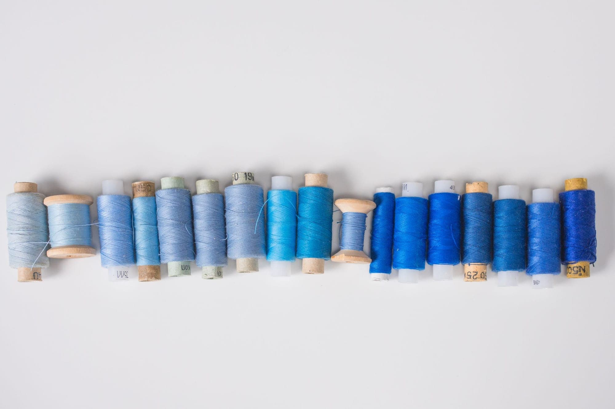
- Pick a physical object in the colour: a scarf, a cushion, a reel of thread or a card from a paint chart. Paint charts are handy because the chips are flat and evenly coloured.
- Photograph it near a window or outdoors in shade, with no flash and no filter.
- Put white paper in the frame, so whoever looks at the photo can see how far the camera has warmed or cooled it.
- Say exactly which part you mean if the object has several colours, for example “the darker stripe, not the background”.
- Show matching colours together. If the kameez, trousers and dupatta must work as a set, photograph the references side by side.
How colour is agreed with us
With Fabric + Stitching, we send photos and a description of the fabric we suggest, and the colour is agreed in your written quote before anything is cut. Your four-part description and reference photo are what we work from when choosing what to suggest.
Be realistic about the last step. Dyed fabric comes in the shades that exist, so an exact match to a paint chip or a code is not something any maker can promise. Colours can also look slightly different in the cloth than in a photo, and a small difference in shade is not a fault. If a precise shade matters, tell us before you pay. When you have your description ready, request a quote.
Common questions
Can a tailor match a Pantone or hex code?
A code is a useful way to describe a colour, but fabric is chosen from shades that already exist, so treat it as a reference rather than a target that will be met exactly. The colour of your fabric is agreed in the written quote.
Why does my reference look different on my phone and my laptop?
Screens differ in brightness, warmth and settings, and phones adjust photos automatically. That is why a physical object photographed beside white paper in daylight is a steadier reference than a screenshot.
Is it enough to send a photo without describing the colour?
It helps, but a short description makes the photo much more useful. If the camera has shifted the shade, words such as deep, dusty or leaning green tell the reader which way to correct it.