Styles and design · 8 October 2026 · 4 min read
Matching or contrast thread: does thread colour matter?
Should thread match fabric? Yes, wherever stitching shows: hems, plackets and topstitching. How thread is matched on a print, and when contrast is intended.
 Inspiration
It matters where you can see it
Thread colour matters wherever stitching shows on the outside: hems, plackets, topstitching, buttonholes and the edges of a neckline. Inside seams are hidden, so a near match is enough there. On a plain fabric the thread is matched to the fabric; on a print it is matched to the main or background colour, or to the colour where the stitching falls. Contrast thread is a separate choice, made on purpose as a design detail.
Where thread shows on a kameez
Before deciding, it helps to know which lines will be visible:
- A machine-stitched hem on the kameez, sleeves and trousers.
- Topstitching around a placket, collar or yoke.
- Buttonholes, which are dense blocks of thread.
- The visible edge stitching on a neckline facing or binding.
- The stitching that holds lace or a border in place.
Matching on a plain fabric
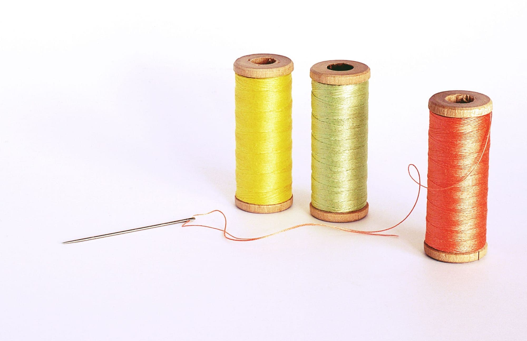
A single strand of thread looks lighter than the same colour in a block of fabric, because it catches light differently. For that reason a thread one shade darker than the fabric usually reads as a perfect match. Sheen plays a part too: a shiny polyester thread on a matt cotton can stand out even when the colour is right. Comparing a strand laid across the fabric in daylight is the simplest test.
On very pale fabrics, white and ivory are not interchangeable. A bright white thread on an ivory kameez shows as a cold line.
Matching on a printed fabric
On a print there is rarely one right colour, so the choice follows where the stitching sits. These rules of thumb help:
- Use the background colour for long lines such as hems and side seams, since that is what surrounds the stitching.
- Follow the border when the hem runs along a printed or embroidered border; the thread should match the border, not the body.
- Pick a blending neutral, such as a soft grey or beige, on a busy multicolour print where no single colour dominates.
- Think about the trousers separately when they are a plain colour: their hems take a thread matched to them, not to the kameez. Our guide to pairing printed and plain pieces covers the colour side of that.
When contrast stitching is the point
Contrast thread turns stitching into decoration. On a plain kurta, a line of topstitching in a colour picked from the dupatta ties the outfit together; on a dark cotton, an ivory topstitch gives a crisp, tailored edge. It works best on firm fabrics where the line stays straight, and on simple shapes where it is not competing with a print. Our guide to plain suits with presence has more ideas in this direction.
If you want contrast stitching, show it in a photo and say where. A design with details like this can be sent through Send Your Design, and you can start a design quote with the thread colour in your notes. It is confirmed in the written quote, so nothing is left to a guess on the day.
Common questions
What colour thread suits a black and white print?
Usually the colour that covers more of the fabric near the stitching. On an even mix, black tends to blend better than white, which shows on the black areas.
Does the lining need its own thread colour?
Inside seams of the lining are hidden, so a close match is fine. Where the lining is stitched to a visible edge, the thread is matched to the outside fabric.
Can I choose the thread colour if I send my own fabric?
Yes. Mention it in your notes, especially for contrast topstitching, and it is confirmed in your written quote.