Embroidery and fancy work · 8 October 2026 · 4 min read
Tone-on-tone or contrast embroidery: which to choose?
Tone on tone embroidery uses thread close to the fabric colour; contrast uses a different one. Compare visibility, photos, ageing and occasion, then choose.
 Inspiration
The difference in a sentence
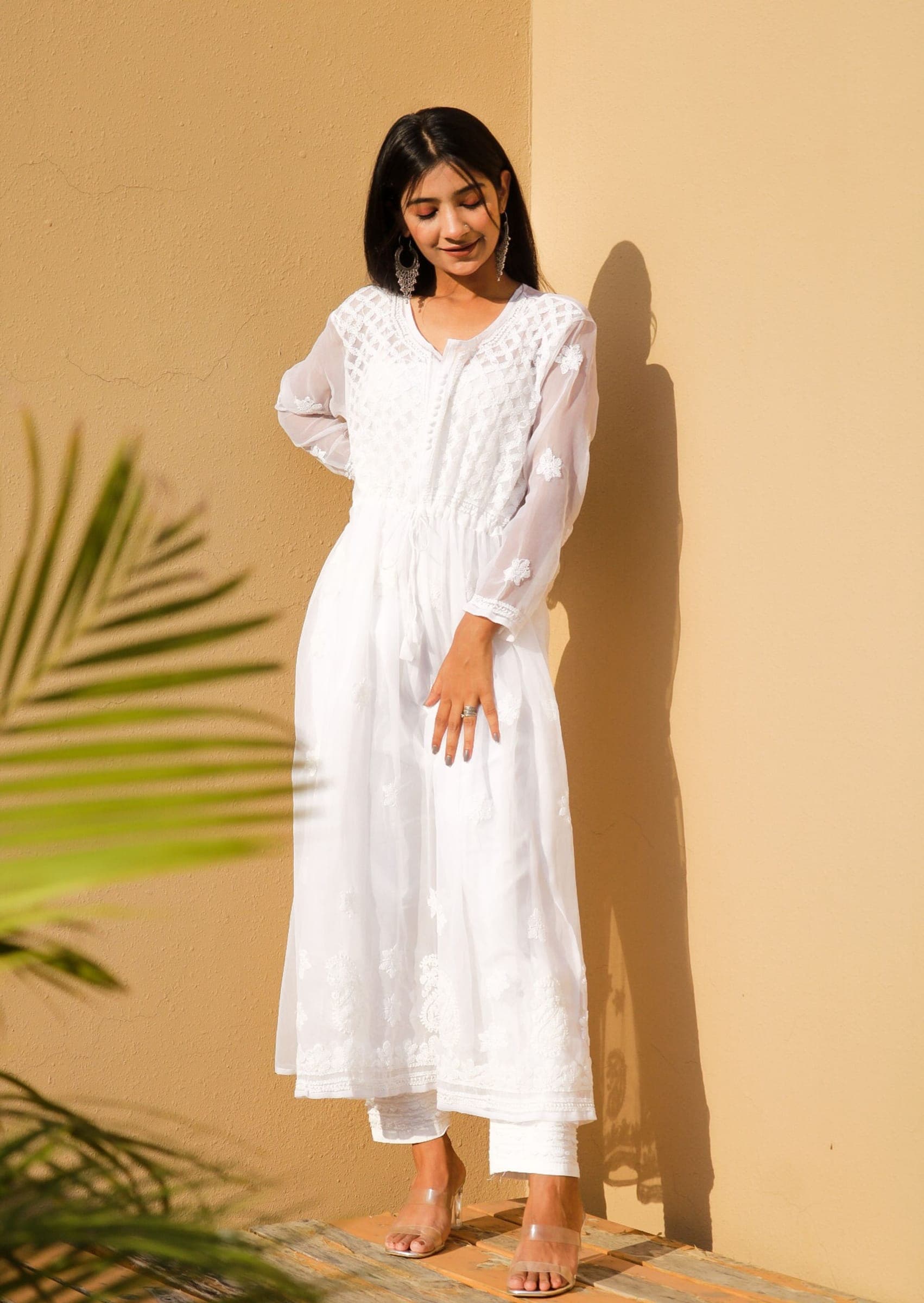
Tone on tone embroidery uses thread in the same colour family as the fabric, a shade or two lighter or darker, so the pattern shows quietly. Contrast embroidery uses a clearly different colour, so the pattern is the first thing you see. Choose tonal for texture and repeat wear, and contrast when you want the design to carry across a room.
Tone-on-tone, self-colour and contrast: the terms
Three terms cover the range. White chikankari on white cotton is the most familiar self-colour embroidery; our chikankari guide describes it.
- Self-colour, or self embroidery: thread matched to the fabric as closely as possible, such as white on white or black on black. In South Asian fabric terms, self means the same colour as the ground. The pattern shows only through the sheen and height of the stitches.
- Tone-on-tone, or tonal: the same colour family in a different depth, for example dusty pink thread on blush, or navy on mid blue.
- Contrast: a different colour altogether, such as white on black, mustard on teal or multicoloured thread on cream.
How they compare
Neither is better. They behave differently in six ways.
- Visibility: tonal work is clear at arm’s length and fades into the fabric from across a room. Contrast reads from a distance.
- Photos: tonal embroidery often disappears on camera, especially white on white under flash. Contrast photographs clearly. If photos matter, as on Eid, choose a little more depth between thread and fabric.
- Ageing: contrast shows everything: slight fading, a pulled thread, any dye that runs from dark thread onto a pale ground. Tonal work hides small flaws and ages gracefully.
- Proportion: contrast draws the eye to wherever it sits, so placement has to be right. Tonal work adds texture without breaking the line of the outfit, which helps a kameez look longer.
- Versatility: a tonal kurta goes with any dupatta, trousers or jewellery and can be worn often without being remembered. A contrast piece is more distinctive and harder to restyle.
- Amount of work: the same. Colour does not change the number of stitches; coverage and density do.
Making tonal work show
A tonal design needs something other than colour to be seen. Three things help. First, sheen: glossy thread on a matte fabric such as lawn, cambric or khaddar stands out, while on satin it can vanish. Second, height: raised and filled stitches show more than fine outlines. Third, depth of shade: one or two shades darker than the fabric looks rich, and one or two lighter looks fresh. On a printed fabric, tonal embroidery tends to get lost in the print, so contrast or a plain ground works better there.
An exact match also depends on light. Thread and fabric that agree in daylight can look slightly different under warm indoor bulbs, which is normal and not a fault. For whole outfits built on one colour, see monochrome and tonal suits.
Which to choose for the occasion
For work, university and everyday wear, tonal or self-colour embroidery gives polish without fuss. For Eid, dinners and parties, contrast, or tonal thread with a metallic outline, gives more presence. A useful middle path is to take the contrast colour from something already in the outfit: the dupatta, the trouser fabric or one colour in the print. A tonal kurta is also the easiest way to make a plain suit look considered.
Words to use in your quote
Say which of the three you want and how strong the difference should be. Add a photo, and remember that screens shift colour slightly. When you customise one of our designs or send your own, we confirm what is possible on your fabric and design in the written quote. The custom embroidery page explains the levels and placements. Phrases like these leave little room for doubt:
- “Self-colour thread, matched as closely as possible to the fabric.”
- “Tone-on-tone, one or two shades darker than the fabric.”
- “Contrast embroidery in ivory, to match the dupatta.”
- “Matte thread” or “thread with a sheen”, if you have a preference.
Common questions
What does self embroidery mean?
It means embroidery in the same colour as the fabric, so the design shows through texture and sheen instead of colour. White on white and black on black are the usual examples.
Does tone-on-tone embroidery show up in photos?
Often only faintly. Side lighting and close-ups bring it out, while flash and distance flatten it. For an outfit that needs to show on camera, pick thread a couple of shades away from the fabric.
Is tonal embroidery suitable for Eid?
Yes. Tonal work on a good fabric looks refined, and a tonal design with a little metallic outline or a contrast dupatta has plenty of occasion feel.
More guides
- Choosing embroidery placement for a suit, piece by piece
- Embroidery on organza: crisp, sheer and delicate
- What is jaal embroidery? All-over patterns explained
- Types of lace for suits: names, looks and uses
- Embroidered trouser hems: what a paincha can carry
- What is kantha embroidery? Running stitch explained