Occasions and ordering · 5 October 2026 · 4 min read
Why do fabric colours look different online?
Why do clothes look a different colour online? Lighting, camera settings and your screen each shift the shade. How to judge a photo, and what we treat as a fault.
 Inspiration
The short explanation
Clothes look a different colour online because three things stand between the cloth and your eye: the light it was photographed in, the camera that recorded it and the screen showing it to you. Each one shifts the shade a little, and the shifts add up. The fabric has one colour; the photo is one version of it.
That is why a single kameez can look coral on a phone and salmon on a laptop. It is also why a careful seller, us included, tells you in advance that a small difference in shade between photo and garment is normal.
Three places the colour changes
Follow the picture from the cloth to your eye and it passes through three filters.
- The light. Midday daylight is neutral and even. Indoor bulbs are warmer and push everything towards yellow. Open shade outdoors leans blue. A maroon shot by a window and the same maroon shot under a lamp are two different pictures.
- The camera. Phones and cameras guess what should be white in a scene and correct everything else to suit, a setting called white balance. Many also lift contrast and saturation to make pictures look lively. Strong reds, purples and blue-greens are among the shades they find hardest to record faithfully.
- The screen. No two displays are set alike. Brightness, a night or eye-comfort mode that warms the picture, and the vivid colour modes on many phones all change what you see.
The fabric plays a part too
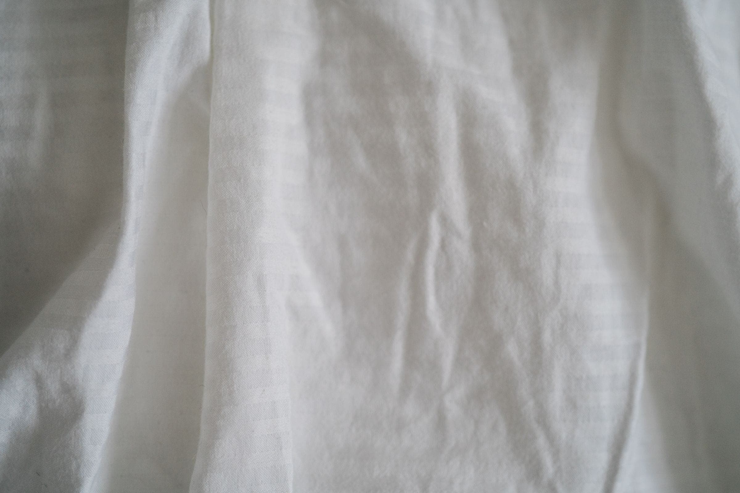
Cloth is not paint. One dye reads differently depending on what it has been applied to.
- Sheen: silk, satin and other shiny weaves reflect the light source, so they look paler on the folds and darker in the shadows. Matte cotton looks flatter and more even.
- Sheerness: chiffon, organza and net let whatever is underneath show through. A pale lining lifts the colour; a dark one deepens it. Our note on when a kameez needs lining covers this.
- Texture: a textured weave such as khaddar scatters light and looks softer in tone than a smooth lawn dyed to match.
- The light where you stand: two fabrics can agree in daylight and part company under evening lighting. The technical name is metamerism, and it is the reason matching should be judged by a window.
How to judge a photo more reliably
A few habits make a screen far more trustworthy.
- Turn off night mode or any blue-light filter, and raise the brightness.
- Look on a second device if you can. Where the two disagree, the truth is probably between them.
- Find something in the frame whose colour you know: skin, a white wall, a wooden floor. If the white wall looks cream, the whole picture is running warm.
- Read the colour name and description as well as the picture. A “deep teal” label under a bright turquoise photo is a reason to ask.
- Compare every photo of the piece, not only the first. Close-ups are usually nearer the truth than styled shots.
- Ask for a plain daylight photo, without filters, if the exact shade matters to you.
What we treat as normal, and what is a fault
Our position is simple. Colours can look slightly different from the photos because of lighting, the camera and your screen, and a small difference in shade is not a fault. A fault is an outfit that does not match the design or measurements agreed in your written quote. In that case we correct or remake it without charge for the work, as long as you report it no later than 7 days after delivery, and the postage both ways is yours to pay. The details are on the payment and cancellations page.
We do not send free samples, so the photo and the written description carry the weight. If a shade has to sit beside something you already own, say so before you approve the quote. Tell us what it must go with and send a daylight photo of that item; with Fabric + Stitching we confirm in your written quote what we can supply. The guide to choosing fabric explains what else helps, and the quote form is where to begin.
Common questions
Will the colour match the photo exactly?
Expect it to be close, not identical. Lighting, the camera and your own screen each shift a shade slightly, which is why a small difference is not treated as a fault. If an exact match matters, tell us before you approve the quote.
Which colours change the most between screen and fabric?
Strong reds, purples, bright pinks and blue-greens such as teal and turquoise tend to shift the most, because cameras and screens reproduce them less faithfully. Whites and creams are also hard to tell apart in photos.
Can I see the fabric before I order?
We do not send free samples. Fabric supplied by us is agreed with you in the written quote before anything is cut, so ask for whatever description or photo you need at that stage.